Stand out. Stay together.
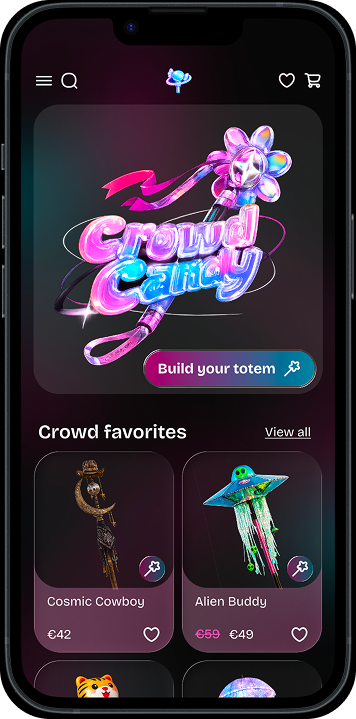
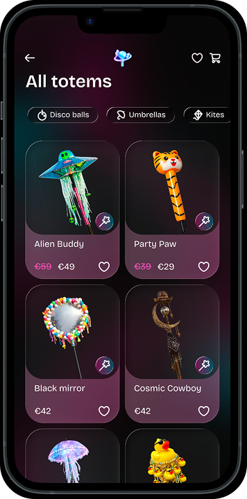
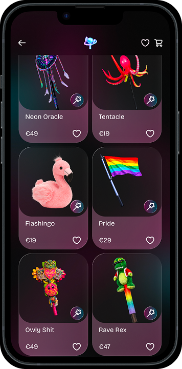
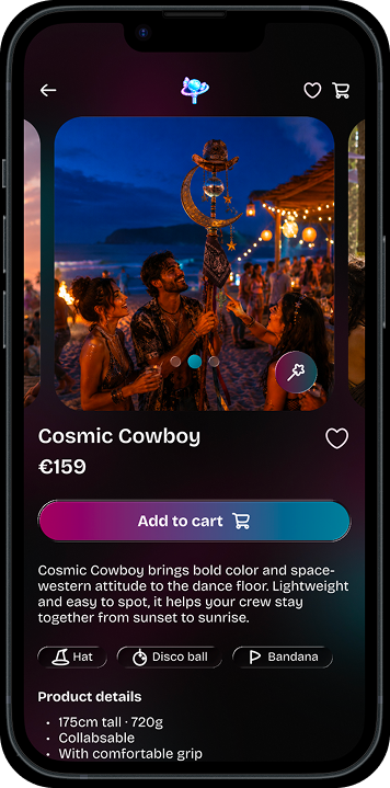
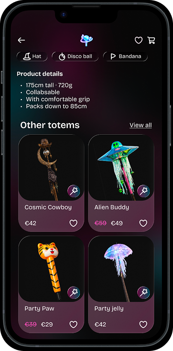
Crowd Candy is a mobile e-commerce concept for festival-goers to create and buy festival totems: visible markers that help groups find each other in dense crowds while expressing something about who they are.
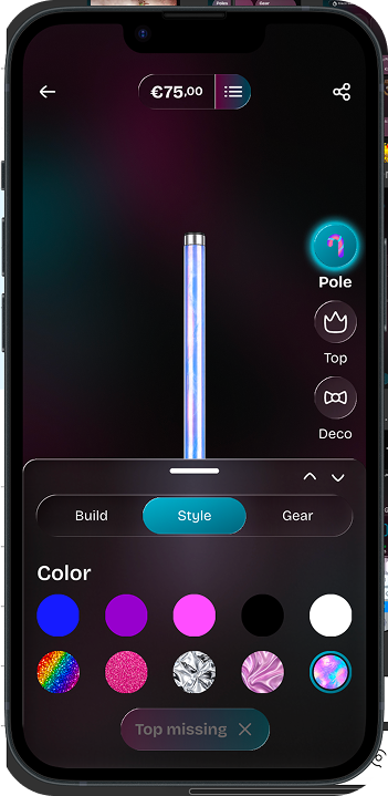
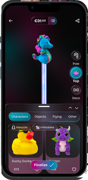
At its center is Totem Studio, a customizer for building a totem from the pole up with a live preview.
- Research
- Product definition
- Prototyping
- Testing
- Iterating
Challenge
Find each other first
Totems primarily act as visual reference points that help groups reconnect in large crowds.
“Try going to a festival with no cell service and a crowd of 12,000 people. It's pretty much nearly impossible without a totem.”
Identity matters, within limits
LEDs and deco make groups recognizable and give totems personality. But when oversized or intrusive, they can frustrate other festival-goers.
“I love that it is another avenue for people to express their creativity.”
DIY has practical trade-offs
DIY totems take time, materials and skills. Size, weight, stability and portability also affect the experience.
“Build it sturdy. By far the most annoying totems are the ones that keep collapsing on the people around it.”
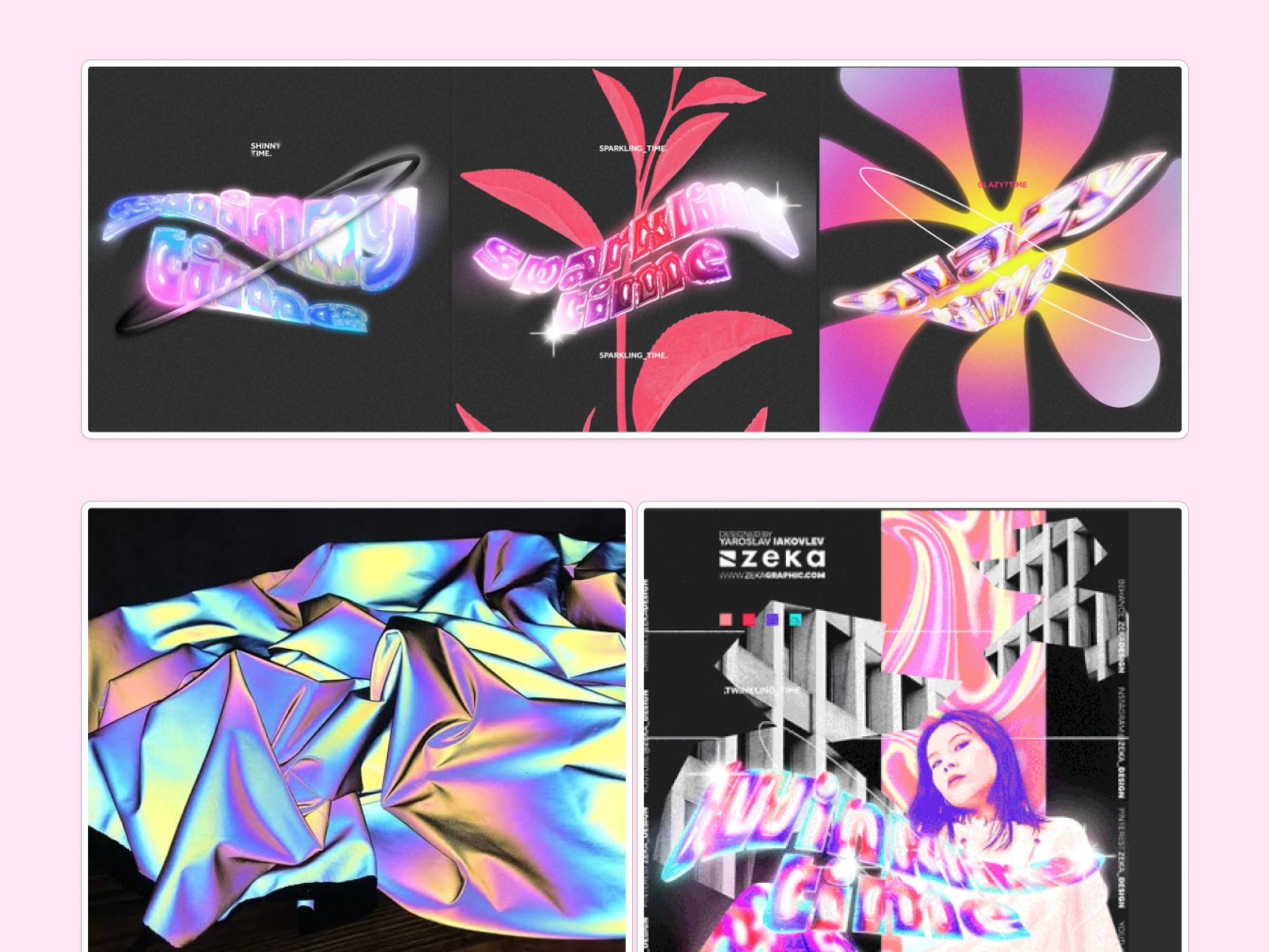
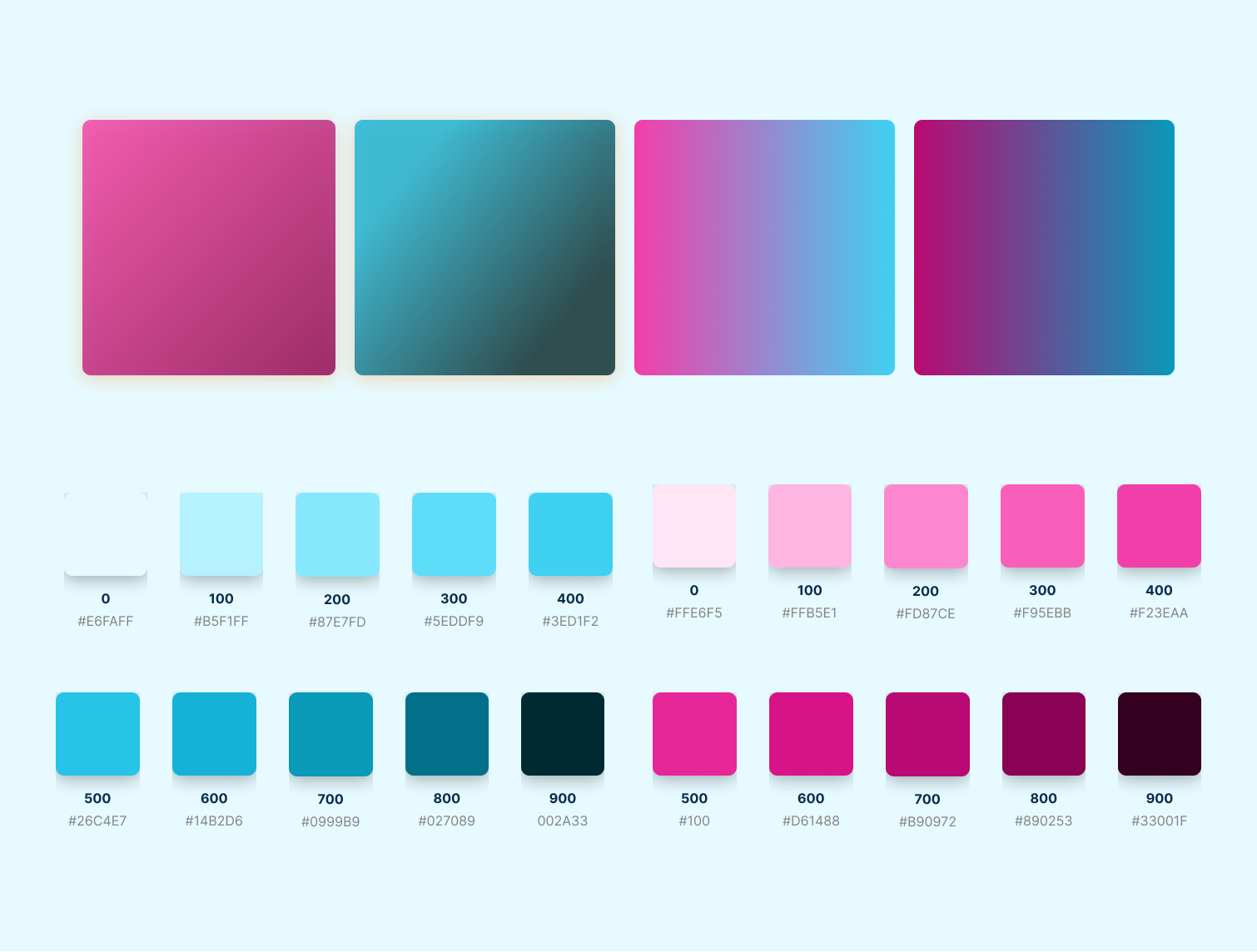
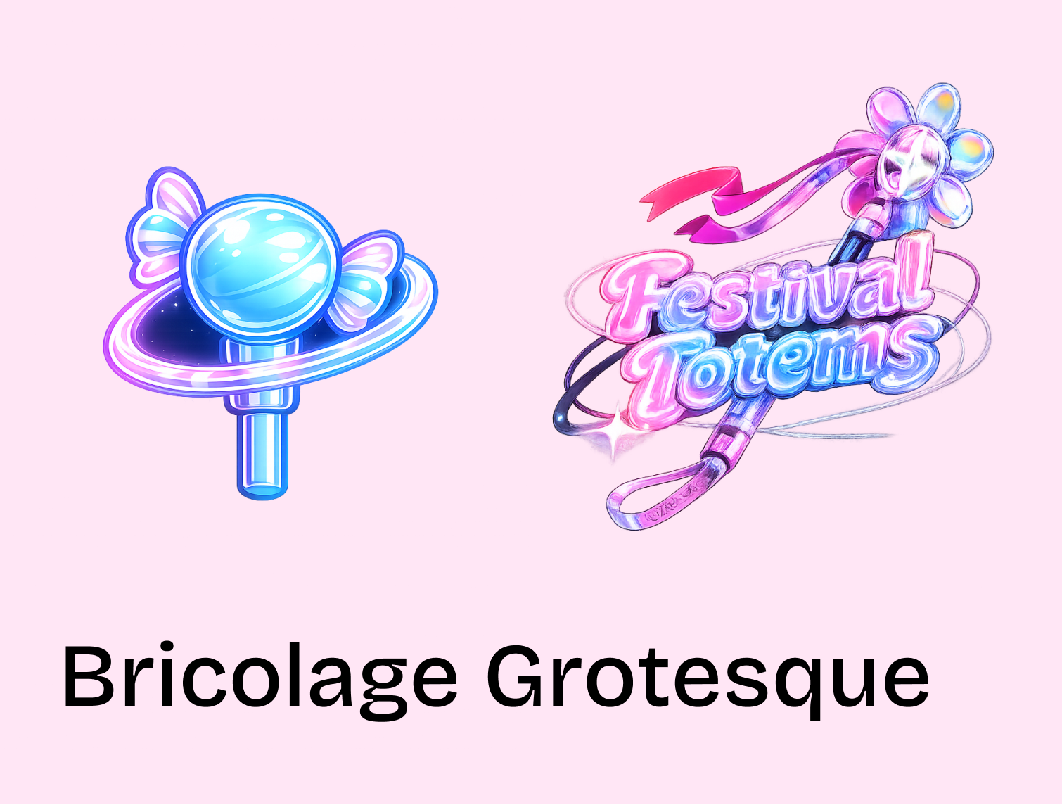
Visual direction
Key design decisions
Build from the pole upward
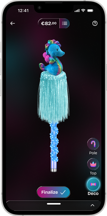
The Studio mirrors the physical object Pole → Top → Decoration with size, collapsibility, style and gear surrounding that structure.
Preview every choice
The assembled totem stays visible while users customize it. The preview never leaves the screen and the user experience is interactive so they can project themselves.
Make interactions feel electric
A neon glow confirms each choice while bringing Crowd Candy’s rave energy into the interaction.
Iterations
13 usability tests (including 3 moderated interviews) showed that the concept was understood, but a few moments in the customizer needed clearer feedback and stronger completion cues. Rather than redesigning the experience, we focused V2 on four targeted changes.
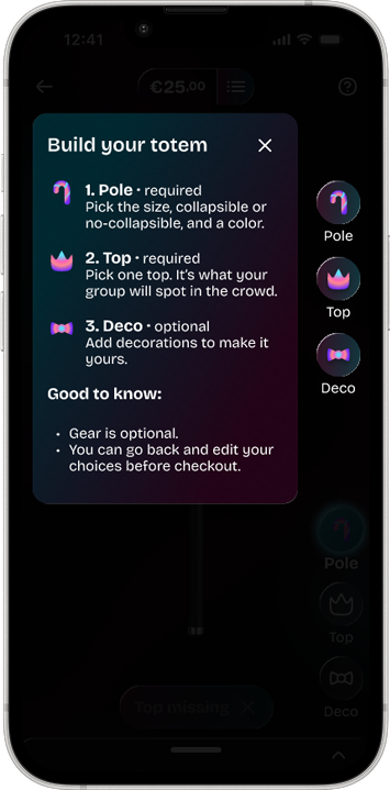
Guide the build until clear completion
Users weren’t always sure what was required, optional, or when their totem was complete.
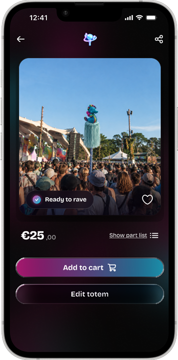
Show the totem where it belongs
Participants wanted to see their creation in a real festival environment before buying it.
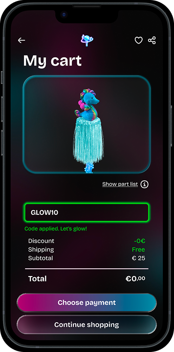
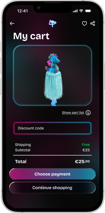
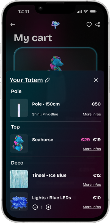
Show what users are paying for
Users could see the total price change as they customized, but had limited visibility into what each individual part was contributing to the final cost.
Ease catalogue navigation
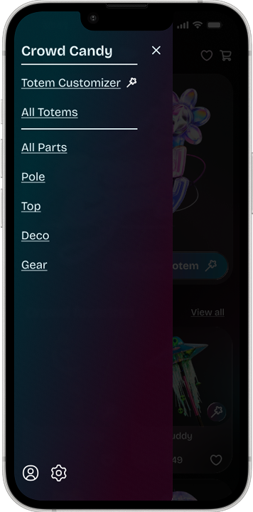
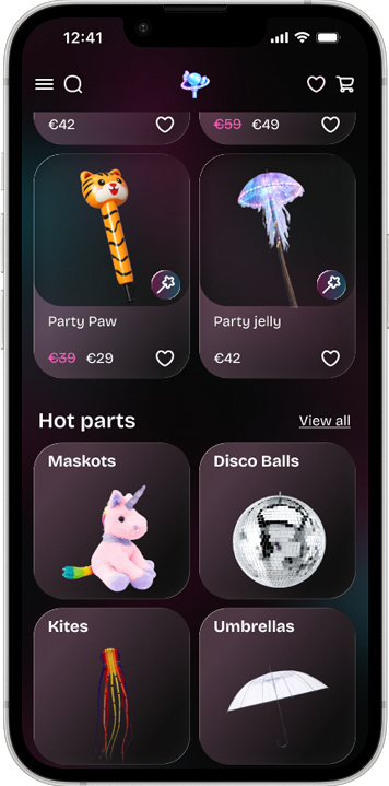
Users could browse pre-made totems through a clear "View all" action, but single-part categories on the homepage did not offer the same option. Users also lacked an easy way to move between the different parts of the app.
Deliberately did not change
Not every participant was part of our core festival-going audience. We therefore used feedback from non-festival-goers to assess general usability, but gave it less weight when judging festival-specific needs or product positioning.
It was strongly connected to participants unfamiliar with festival totems.
Valid feedback, but with our concept it does not bring value right now to build a conventional catalogue model.
Treated as a future opportunity rather than adding more complexity to the MVP.
Open questions
How much structure does the customizer need without becoming restrictive or adding friction?
How should browsing evolve as the number of individual parts grows?
How well can users judge whether their creation will stand out before purchasing?